This week, I put out another "1987 And All That" column on The Chemical Box about Ninja High School and wrote a piece for PopMatters on Dial H. Normally I would say a little more about each of these, but I just got back a few hours ago from a brief but exhausting trip to Austin for a comedy festival, and I am too wiped out to elaborate much. That being said...
Something I Failed to Mention
In the Ninja High School post, I focused on Ben Dunn's main narrative, since it's what the comicbook is really about. However, the first issue of the series also has an excellent back-up feature written and inked by James Hanrahan with Dunn on pencils. Titled "Arnie: Gives a Speech," the story open with relatively minor character Arnie delivering a lecture to his classmates about the finer details of the M-16 assault rifle. This leads Professor Steamhead, for no apparent reason, to start arguing with Arnie, claiming the AK-47 is a superior weapon. The two of them begin shooting at each other while at the same time continuing to debate the pros and cons of various guns. Eventually, the police are brought in to stop the violence, but they, too, mostly just discuss what firearms they're using before throwing a grenade into the situation. It's an absured but highly amusing little tale, basically just an excuse for Hanrahan to show off some of his weapons knowledge through the mouths of fictional characters. But the approach of having this conversation take place in the middle of a firefight is very funny and well-done, and because the whole back-up is only six pages (including the inside back cover) the concept is delivered and heightened effectively and efficiently. It may be my favorite thing about Ninja High School, so I figured I had to give it recognition somewhere.
Sunday, September 1, 2013

Friday, August 30, 2013
Monthly Dose: August 2013
Monthly Dose is a semi-regular column where I reread one issue each month of long-completed series.
100 Bullets #10: Eduardo Risso demolishes the opening page. It's just three panels, starting very close on Cole Burn's face and then pulling out to reveal the rest of him, but there's a ton of detailed and evocative work within them. At the end of last issue, Cole was surrounded by men sticking guns in his face. When the story picks up here, all those men are dead by his hand, and he's not entirely sure how he was able to kill them. The intensity of his expression, a mix of fear and rage and relief, is heavy in all three panels. Even though it's not yet clear what is going on, Cole's distraught state of mind is immediately obvious. From that excellent opening, Risso and Brian Azzarello do a great job of slowly but steadily changing Cole's personality as his memories of the man he used to be return. He becomes more comfortable and calm, replacing his shock with amusement and, eventually, smugness. The entire issue is about the fake Cole slipping away while the real Cole resurfaces, so it's not especially full of action or thrills. But moments like the silent two-page flashback or Cole blowing up his ice cream truck are excitement enough, and the dialogue between Cole, Shepherd, and Graves is superbly fascinating. Azzarello is able to explain an awful lot of what's going on without revealing his entire plan yet, which has not always been the case in this book. Often, things feel too vague, but here they are just specific enough to be informative without spoiling anything important. My favorite character is introduced in full, the important concept of the Minutemen having their buried memories brought back by a special code word is established, and both Risso and Azzarello operate at their best. This is a fabulous issue, quiet in tone but meaty on every page and full of significant set-up for the series' future.
The Intimates #10: I'm torn by this issue. On the one hand, the story reaches a narrative peak and a few of the young superheroes we've been following all this time finally get to prove their mettle, which is great. On the other hand, the scene where that happens is drawn so poorly as to make it partially inscrutable. Third hand: best info scrolls in the entire series. They're a bit too self-referential here and there, and maybe somewhat obvious in their content, but I adore them anyway. Since this is the last issue of the summer vacation period of the series, Joe Casey uses the info scrolls to reflect on how summer vacations used to feel as a kid, and how that changes over time and has no real equivalent as an adult. He gets it just right, making me powerfully nostalgic. And he has a respect and admiration for childhood attitudes, pairing perfectly with the growing-up-too-fast action they accompany in the main story. Scott Iwahashi returns as the penciler of the A-plot, about Punchy and Destra breaking into a Devonshire Foods facility to figure out what is wrong with the food they're served at school. There they run into Sparky, now apparently working for the man, seeing as he attacks them so recklessly it gets him killed. It also destroys the building he was supposed to protect, but I'm not sure exactly how that happens. The fight scene between Sparky, Punchy, and Destra is something I have studied several time, and for the life of me, I cannot figure out what the hell happens. They definitely fight. Sparky gets knocked into something, I think, presumably some piece of machinery, but it's extremely unclear. Then he overloads and, I think, blows up. Or maybe whatever he was knocked into blows up because of his powers? There's an explosion. To be fair, the parts I am talking about only account for three pages of material, and everything else Iwahashi does is serviceable but...it's rough. Blurry and sparse and just weird to look at. Luckily, Carlos D'anda is also on hand to draw one scene of Empty Vee and two of Duke. His work is more sure of itself, and he does a good job of making the Vee pages look different than the Duke pages. Vee is having fun, Duke is miserable, and that difference is reflected in all the details that surround them. Also, the Duke scenes have no info scroll, a rarity for this title, but done well here. Duke's scenes are the most emotionally fraught, grown-up material, so they get to stand on their own. It's a mixed bag of an issue, with some of the best and worst material this title has to offer.
X-Force (vol. 1) #10: In the aftermath of the big, bad fight that took up the last few issues, Rob Liefeld and Fabian Nicieza take time this month to actually develop some plot. Cable gives Cannonball the full explanation as to how he could come back from death—he's a High-Lord, also known as an External, a special kind of immortal mutant that Cable knows all about. Elsewhere, we meet the other Externals, one of whom is apparently Gideon, and they lay out their plans to recruit Cannonball for their little immortal gang. And in the most action-packed sections of the issue, Weapon X goes toe-to-toe with Stryfe who, as we learned not long ago and Weapon X is seeing for the first time here, is actually Cable. Exactly how it's possible that Cable could be his own nemesis is left mysterious for now, with Stryfe offering only the most obnoxiously cryptic clues. There are a lot of moving pieces, but Nicieza does a good job of keeping all the new information clear, at times even bordering on being overly expository. Liefeld, too, balances things well, giving the appropriate number of pages to each of the story threads. Cannonball gets to discuss his understandably conflicted feelings about his newly discovered immortality at length, the Externals have more than enough room to bicker and scheme, and Weapon X has time to fight off all of Stryfe's lackeys before the two men battle one another directly. There are a few weird moments, like a full-page splash of Cable looking uncomfortably muscular while he makes a not-very-exciting speech about how nobody should mess with his team. And man...X-Force is a pretty callous group when it comes to their dead enemies (Sauron and Phantazia died last issue, I guess, though I don't remember that being obvious at the time). Despite these bumps in the road, this is a smoother issue than usual, able to get a lot done and seed several things for the book's future. I find myself eager for next month's issue for the first time in a decent while, not edge-of-my-seat anxious or anything, but at least looking forward to it.
100 Bullets #10: Eduardo Risso demolishes the opening page. It's just three panels, starting very close on Cole Burn's face and then pulling out to reveal the rest of him, but there's a ton of detailed and evocative work within them. At the end of last issue, Cole was surrounded by men sticking guns in his face. When the story picks up here, all those men are dead by his hand, and he's not entirely sure how he was able to kill them. The intensity of his expression, a mix of fear and rage and relief, is heavy in all three panels. Even though it's not yet clear what is going on, Cole's distraught state of mind is immediately obvious. From that excellent opening, Risso and Brian Azzarello do a great job of slowly but steadily changing Cole's personality as his memories of the man he used to be return. He becomes more comfortable and calm, replacing his shock with amusement and, eventually, smugness. The entire issue is about the fake Cole slipping away while the real Cole resurfaces, so it's not especially full of action or thrills. But moments like the silent two-page flashback or Cole blowing up his ice cream truck are excitement enough, and the dialogue between Cole, Shepherd, and Graves is superbly fascinating. Azzarello is able to explain an awful lot of what's going on without revealing his entire plan yet, which has not always been the case in this book. Often, things feel too vague, but here they are just specific enough to be informative without spoiling anything important. My favorite character is introduced in full, the important concept of the Minutemen having their buried memories brought back by a special code word is established, and both Risso and Azzarello operate at their best. This is a fabulous issue, quiet in tone but meaty on every page and full of significant set-up for the series' future.
The Intimates #10: I'm torn by this issue. On the one hand, the story reaches a narrative peak and a few of the young superheroes we've been following all this time finally get to prove their mettle, which is great. On the other hand, the scene where that happens is drawn so poorly as to make it partially inscrutable. Third hand: best info scrolls in the entire series. They're a bit too self-referential here and there, and maybe somewhat obvious in their content, but I adore them anyway. Since this is the last issue of the summer vacation period of the series, Joe Casey uses the info scrolls to reflect on how summer vacations used to feel as a kid, and how that changes over time and has no real equivalent as an adult. He gets it just right, making me powerfully nostalgic. And he has a respect and admiration for childhood attitudes, pairing perfectly with the growing-up-too-fast action they accompany in the main story. Scott Iwahashi returns as the penciler of the A-plot, about Punchy and Destra breaking into a Devonshire Foods facility to figure out what is wrong with the food they're served at school. There they run into Sparky, now apparently working for the man, seeing as he attacks them so recklessly it gets him killed. It also destroys the building he was supposed to protect, but I'm not sure exactly how that happens. The fight scene between Sparky, Punchy, and Destra is something I have studied several time, and for the life of me, I cannot figure out what the hell happens. They definitely fight. Sparky gets knocked into something, I think, presumably some piece of machinery, but it's extremely unclear. Then he overloads and, I think, blows up. Or maybe whatever he was knocked into blows up because of his powers? There's an explosion. To be fair, the parts I am talking about only account for three pages of material, and everything else Iwahashi does is serviceable but...it's rough. Blurry and sparse and just weird to look at. Luckily, Carlos D'anda is also on hand to draw one scene of Empty Vee and two of Duke. His work is more sure of itself, and he does a good job of making the Vee pages look different than the Duke pages. Vee is having fun, Duke is miserable, and that difference is reflected in all the details that surround them. Also, the Duke scenes have no info scroll, a rarity for this title, but done well here. Duke's scenes are the most emotionally fraught, grown-up material, so they get to stand on their own. It's a mixed bag of an issue, with some of the best and worst material this title has to offer.
X-Force (vol. 1) #10: In the aftermath of the big, bad fight that took up the last few issues, Rob Liefeld and Fabian Nicieza take time this month to actually develop some plot. Cable gives Cannonball the full explanation as to how he could come back from death—he's a High-Lord, also known as an External, a special kind of immortal mutant that Cable knows all about. Elsewhere, we meet the other Externals, one of whom is apparently Gideon, and they lay out their plans to recruit Cannonball for their little immortal gang. And in the most action-packed sections of the issue, Weapon X goes toe-to-toe with Stryfe who, as we learned not long ago and Weapon X is seeing for the first time here, is actually Cable. Exactly how it's possible that Cable could be his own nemesis is left mysterious for now, with Stryfe offering only the most obnoxiously cryptic clues. There are a lot of moving pieces, but Nicieza does a good job of keeping all the new information clear, at times even bordering on being overly expository. Liefeld, too, balances things well, giving the appropriate number of pages to each of the story threads. Cannonball gets to discuss his understandably conflicted feelings about his newly discovered immortality at length, the Externals have more than enough room to bicker and scheme, and Weapon X has time to fight off all of Stryfe's lackeys before the two men battle one another directly. There are a few weird moments, like a full-page splash of Cable looking uncomfortably muscular while he makes a not-very-exciting speech about how nobody should mess with his team. And man...X-Force is a pretty callous group when it comes to their dead enemies (Sauron and Phantazia died last issue, I guess, though I don't remember that being obvious at the time). Despite these bumps in the road, this is a smoother issue than usual, able to get a lot done and seed several things for the book's future. I find myself eager for next month's issue for the first time in a decent while, not edge-of-my-seat anxious or anything, but at least looking forward to it.
Thursday, August 29, 2013
That's Entertainment: the Store I've Been Looking For
Two months ago, I moved from Texas to Massachusetts. Not only that, I moved from Austin to Plymouth, meaning I went from a city with 5 or 6 solid comicbook stores to a town with none. I knew it'd be a challenge to find a store close enough with a selection big and consistent enough for me to be able to get all the titles I wanted each week. And even when I located a few in the general area, none of them were quite up to snuff. Poor organization, under-ordering, and geographical distance kept any of the first several stores I checked out from becoming "my" new local comicbook shop.
Then I got a job in Worcester, and someone I know who lives there recommended that I check out That's Entertainment. He promised me it would blow my mind, and you know what? That's just what it did.
Subscription list service? Check. Clearly organized shelves with all the new titles? Check. Free ordering for anything they're missing? Check. Back issues? Check, and then a second check because they have so damn many of them, and they are super cheap, AND I get 10% off for having a sub list. That's Entertainment is like something out of a dream, not because it's super flashy or has a million amazing deals or anything gimmicky like that. It's just so reliably well-stocked, well-managed, and full to the brim with so many different comicbooks, I could spend all day there without fully digging into it all.
There's also a wide selection of games (board, tabletop RPG, card, video, etc.), DVD's, toys, and other assorted collectibles. Plus they'll buy any of that stuff from you. And they're all super nice folks! It's a great atmosphere, with plenty of space to move around despite how much they have available.
So yeah, That's Entertainment takes the cake, as far as I'm concerned. If everything I mentioned above isn't enough to convince you, here's my favorite part: they've got their own parking, right next to the building, on Lois Lane.
Then I got a job in Worcester, and someone I know who lives there recommended that I check out That's Entertainment. He promised me it would blow my mind, and you know what? That's just what it did.
 |
| Just one of many such rows |
There's also a wide selection of games (board, tabletop RPG, card, video, etc.), DVD's, toys, and other assorted collectibles. Plus they'll buy any of that stuff from you. And they're all super nice folks! It's a great atmosphere, with plenty of space to move around despite how much they have available.
 |
| Just one of many such shelves |
 |
| I probably should've shot this so you could see the store in the background, but trust me, it's there |
Sunday, August 25, 2013
Elsewhere
Been sort of a quiet couple of weeks for me, as far as writing for other sites. I've had two reviews go up at read/RANT, one on Archer & Armstrong #12 and another on Brother Lono #3. Neither comic thrilled me, but the former had a lot more going for it (and just more going on) than the latter.
After a week off for me at PopMatters, Thursday saw the publication of a column on Thor: God of Thunder. I know it's not like the greatest Thor book ever written, but it taps directly into what I most like about the character, so I talked about that.
Something I Failed to Mention
Dave Johnson is the world's greatest cover artist, as far as I'm concerned. It's not his best effort by any stretch, but his cover for Brother Lono #3 has a few awesome details. The skulls-and-crossbones in the gunshots are a nice not-too-flashy garnish, as is the pattern on Lono's shirt. I also like seeing Lono smiling with such confidence, because he is never happy nor self-assured AT ALL in the actual issue (or series). The best part, no question, is the inclusion of the chihuahua who gets brutally murdered in the issue's first few pages. I really hated the scene of his death, which lacked any purpose or emotional weight and was pure gore for gore's sake. Oddly unrealistic gore, too. Anyway, it's nice that Johnson gave the little guy some extra space, and with such a hilarious, show-stealing expression on his face. The cover has a sense of humor that the story beneath it does not. Humor needn't exist in every story, but this issue had a general lack of any personality, especially if compared to Johnson's opening image.
After a week off for me at PopMatters, Thursday saw the publication of a column on Thor: God of Thunder. I know it's not like the greatest Thor book ever written, but it taps directly into what I most like about the character, so I talked about that.
Something I Failed to Mention
Dave Johnson is the world's greatest cover artist, as far as I'm concerned. It's not his best effort by any stretch, but his cover for Brother Lono #3 has a few awesome details. The skulls-and-crossbones in the gunshots are a nice not-too-flashy garnish, as is the pattern on Lono's shirt. I also like seeing Lono smiling with such confidence, because he is never happy nor self-assured AT ALL in the actual issue (or series). The best part, no question, is the inclusion of the chihuahua who gets brutally murdered in the issue's first few pages. I really hated the scene of his death, which lacked any purpose or emotional weight and was pure gore for gore's sake. Oddly unrealistic gore, too. Anyway, it's nice that Johnson gave the little guy some extra space, and with such a hilarious, show-stealing expression on his face. The cover has a sense of humor that the story beneath it does not. Humor needn't exist in every story, but this issue had a general lack of any personality, especially if compared to Johnson's opening image.
Friday, August 23, 2013
Buttercup Festival is...
It's one of my all-time favorite comicstrips, yet I don't often recommend Buttercup Festival to people. Partially, this comes from a selfish place---I want to keep this comic as mine, even though I know it has countless other fans out there. Then there is the fact that I'm not sure how broad an appeal it has, but even that's not really what stops me from showing it to others. What makes me most hesitant is that Buttercup Festival is difficult to describe, and it's hard to explain what I personally find so attractive about it. Because there aren't really plots, and in some individual strips there isn't even what I would describe as storytelling, it's not easy to define what the series is about. It's not truly about anything, a comic that prioritizes creating a certain sense of wonder or sadness or admiration in its reader rather than delivering a concrete narrative. Often ending on non sequiturs or panels of silence, the strips usually have no real point or purpose beyond providing the briefest, most ethereal moment of elation or depression. But sometimes whatever feeling it evokes is just what I need when I read it.
Written and drawn by poet David Troupes, Buttercup Festival began in 2000 as a strip for the college paper for UMass Amherst. That initial run lasted until 2005 before Troupes put the project on hold. In 2008 it returned, this time online, as "Series II" which is where I was introduced to it. The current incarnation updates on a highly irregular schedule, but every time a new strip is posted, my heart flutters with anticipation.
The main character is nameless and faceless, resembling a grim reaper (hood and scythe) but otherwise having no definitive age or even gender. His/her personality is typically very childlike, full of wonder and curiosity, but there's also a thoughtfulness and an appreciation for nature that denotes some level of maturity. This blend of traits is perhaps the protagonist's best feature, if not the best feature of Buttercup Festival on the whole. The series' generous use of puns, talking food or plants or animals, and general lighthearted goofiness make reading it feel a lot like interacting with kids. But there is a pervasive poignancy as well, from the black-and-white coloring to the often pensive tone, especially in the wordless strips meant only to stir up some specific amount of sadness or joy with the simple beauty of their imagery.
It seems silly to keep attempting to pin down such a hard-to-grab comic, so I'm just going to link to several of my favorite strips that I also think represent the title's range. These are just in the order they were published, and are also all from Series II. If you like any one of these, I suggest just spending the few hours it takes to read all the Buttercup Festival available.
Thirteen
Eighteen
Thirty-One
Forty-Three
Fifty-Four
Sixty-Two
Ninety-Five
One-Seventeen
One-Twenty-Six
Written and drawn by poet David Troupes, Buttercup Festival began in 2000 as a strip for the college paper for UMass Amherst. That initial run lasted until 2005 before Troupes put the project on hold. In 2008 it returned, this time online, as "Series II" which is where I was introduced to it. The current incarnation updates on a highly irregular schedule, but every time a new strip is posted, my heart flutters with anticipation.
The main character is nameless and faceless, resembling a grim reaper (hood and scythe) but otherwise having no definitive age or even gender. His/her personality is typically very childlike, full of wonder and curiosity, but there's also a thoughtfulness and an appreciation for nature that denotes some level of maturity. This blend of traits is perhaps the protagonist's best feature, if not the best feature of Buttercup Festival on the whole. The series' generous use of puns, talking food or plants or animals, and general lighthearted goofiness make reading it feel a lot like interacting with kids. But there is a pervasive poignancy as well, from the black-and-white coloring to the often pensive tone, especially in the wordless strips meant only to stir up some specific amount of sadness or joy with the simple beauty of their imagery.
It seems silly to keep attempting to pin down such a hard-to-grab comic, so I'm just going to link to several of my favorite strips that I also think represent the title's range. These are just in the order they were published, and are also all from Series II. If you like any one of these, I suggest just spending the few hours it takes to read all the Buttercup Festival available.
Thirteen
Eighteen
Thirty-One
Forty-Three
Fifty-Four
Sixty-Two
Ninety-Five
One-Seventeen
One-Twenty-Six
Tuesday, August 20, 2013
Candy Crush Comics
A little less than a month ago, I finally jumped on the Candy Crush Saga bandwagon. For those of you who don't know, it's basically a puzzle game that's become alarmingly popular on smartphones and tablets round the world. There are hundreds or perhaps even thousands of levels, and every so often a new game mechanic is introduced, so that it becomes increasingly complicated to play. The basic premise of the game is that players have to move candies around on the board (or whatever you want to call it) in order to get groups of three or more matching candies to line up, thus eliminating them. The levels have different goals, like certain pieces that need to be cleared, requiring the player to get special "ingredient" pieces down to the bottom of the screen, a specific number of points that must be scored in a certain time frame, and so on.
Part of the genius of Candy Crush's design—aside from the bright colors and explosions and other visual stimuli—is that the levels don't necessarily get harder as they go up in number, so you never know what to expect or how long a given level will take to beat. Sometimes I clear three or four levels in a row with only one try on each of them, where other times it'll take me dozens of attempts over days of playing to complete a single challenge. This creates a weirdly attractive pattern of ups and down, of accomplishment and frustration. When I'm zooming through level levels like it's my job, I feel a strange and powerful joy. I get into a rhythm, a groove, and it's what makes me like the game in the first place. But when I hit a stonewall level that takes longer to defeat, the aggravation can be just as strong. I have at least one friend who deleted the game entirely after getting stuck for like a month on the same puzzle, and in the short time I've owned the game, I've already entertained getting rid of it more than once. No iPhone app is worth this! I think to myself. And I may be right, but just when I start to feel that way, Candy Crush pulls me back in.
Why am I talking about some silly game on this blog? Because emotionally, playing Candy Crush is a lot like writing about comics (or writing about anything). And it's a lot like being a comicbook fan as well.
Far too often, I spend too long working on something for this blog or elsewhere without making any visible progress. Sometimes, I abandon the piece entirely. Just this week, I gave up on trying to write about David Liss and Patrick Zircher's Mystery Men series for the second time. Somehow I can't crack that particular nut—I love the art but have major problems with the story, and I can never express those conflicting feelings in a satisfactory way. Or, well, I guess I just did, if only in a capsule-review-sized space. But my original point was that trying to write intelligently and honestly about comicbooks (or, again, about anything) can be frustratingly slow-going at times. I'll manage to produce two or three paragraphs I can live with, and then stall out completely, staring at the partially finished piece for a long time without adding anything to it. Sometimes this lasts hours, sometimes days, and when I do finally make the decision to abandon a column entirely, there's always a nagging doubt in the back of my mind as to whether or not I should ever bother writing about comics again. This desire to throw in the towel when I'm not advancing in my writing is a heightened version of the same feeling I get when I consider deleting Candy Crush from my phone.
On the other hand, once in a rare while, I feel extremely proud of something I've written or, even better, someone else will respond positively to it. Whether it's an attaboy from an editor at one of the other sites I write for, or a complimentary comment or tweet from a reader, there's nothing as encouraging as having somebody tell me they like what I've done. That's not why I write this stuff—I do it because I wanted a reason to write regularly, and because I'm reading and thinking about comics anyway, so what's the harm in committing those thoughts to Internet paper?—but having the outside world enjoy my work certainly keeps me going when I'm feeling worn out. Those occasional accolades are the equivalent of destroying a new Candy Crush level on the first try. The joy may be fleeting, but it's mighty enough to propel me forward for a good while.
I suppose by now what I'm going to say about the parallels between playing Candy Crush and reading modern comicbooks is fairly obvious. There's a lot of dreck out there, including too many single issues of typically strong series, and some weeks the sense of Why do I bother? is overwhelming. But man...when I read something truly fantastic, something that defies my expectations or pushes the boundaries of the medium or just delivers a damn good story, it's like falling in love with comics all over again. These moments are few and far between, but they show up with just enough regularity that, by now, my devotion as a fan and collector has been firmly solidified. The best issues stick with me forever, their greatness survives reread after reread, their art seeps into my dreams, their characters remain my favorites. Actually, in the longevity of the satisfaction, being a comicbook fan is nothing at all like being a comicbook critic or a Candy Crush player. The happiness the latter two activities bring me is enormous but impermanent, whereas a great comic can be read over and over without lessening its effect.
Part of the genius of Candy Crush's design—aside from the bright colors and explosions and other visual stimuli—is that the levels don't necessarily get harder as they go up in number, so you never know what to expect or how long a given level will take to beat. Sometimes I clear three or four levels in a row with only one try on each of them, where other times it'll take me dozens of attempts over days of playing to complete a single challenge. This creates a weirdly attractive pattern of ups and down, of accomplishment and frustration. When I'm zooming through level levels like it's my job, I feel a strange and powerful joy. I get into a rhythm, a groove, and it's what makes me like the game in the first place. But when I hit a stonewall level that takes longer to defeat, the aggravation can be just as strong. I have at least one friend who deleted the game entirely after getting stuck for like a month on the same puzzle, and in the short time I've owned the game, I've already entertained getting rid of it more than once. No iPhone app is worth this! I think to myself. And I may be right, but just when I start to feel that way, Candy Crush pulls me back in.
Why am I talking about some silly game on this blog? Because emotionally, playing Candy Crush is a lot like writing about comics (or writing about anything). And it's a lot like being a comicbook fan as well.
Far too often, I spend too long working on something for this blog or elsewhere without making any visible progress. Sometimes, I abandon the piece entirely. Just this week, I gave up on trying to write about David Liss and Patrick Zircher's Mystery Men series for the second time. Somehow I can't crack that particular nut—I love the art but have major problems with the story, and I can never express those conflicting feelings in a satisfactory way. Or, well, I guess I just did, if only in a capsule-review-sized space. But my original point was that trying to write intelligently and honestly about comicbooks (or, again, about anything) can be frustratingly slow-going at times. I'll manage to produce two or three paragraphs I can live with, and then stall out completely, staring at the partially finished piece for a long time without adding anything to it. Sometimes this lasts hours, sometimes days, and when I do finally make the decision to abandon a column entirely, there's always a nagging doubt in the back of my mind as to whether or not I should ever bother writing about comics again. This desire to throw in the towel when I'm not advancing in my writing is a heightened version of the same feeling I get when I consider deleting Candy Crush from my phone.
On the other hand, once in a rare while, I feel extremely proud of something I've written or, even better, someone else will respond positively to it. Whether it's an attaboy from an editor at one of the other sites I write for, or a complimentary comment or tweet from a reader, there's nothing as encouraging as having somebody tell me they like what I've done. That's not why I write this stuff—I do it because I wanted a reason to write regularly, and because I'm reading and thinking about comics anyway, so what's the harm in committing those thoughts to Internet paper?—but having the outside world enjoy my work certainly keeps me going when I'm feeling worn out. Those occasional accolades are the equivalent of destroying a new Candy Crush level on the first try. The joy may be fleeting, but it's mighty enough to propel me forward for a good while.
I suppose by now what I'm going to say about the parallels between playing Candy Crush and reading modern comicbooks is fairly obvious. There's a lot of dreck out there, including too many single issues of typically strong series, and some weeks the sense of Why do I bother? is overwhelming. But man...when I read something truly fantastic, something that defies my expectations or pushes the boundaries of the medium or just delivers a damn good story, it's like falling in love with comics all over again. These moments are few and far between, but they show up with just enough regularity that, by now, my devotion as a fan and collector has been firmly solidified. The best issues stick with me forever, their greatness survives reread after reread, their art seeps into my dreams, their characters remain my favorites. Actually, in the longevity of the satisfaction, being a comicbook fan is nothing at all like being a comicbook critic or a Candy Crush player. The happiness the latter two activities bring me is enormous but impermanent, whereas a great comic can be read over and over without lessening its effect.
Friday, August 16, 2013
On the Title Panel of Harbinger #15
The latest issue of Valiant's Harbinger is probably going to be a divisive one amongst fans, because of the sudden severity of its ending. I won't bother spoiling it here, but at the close of the issue, one of the most important characters in the series goes through a major and unexpected change that I suspect will bother many people. Personally, I didn't mind it, even though I adore the character in question (it's Kris, and she's awesome), but I'm not here to talk about the specifics of the issue's conclusion, anyway. All you need to know about the end of Harbinger #15 is that it is exceedingly dark, even for this series. What I'm interested in is how a few simple but smart choices at the beginning of the issue foreshadowed that darkness.
 This panel is what I really want to talk about. When I first read this issue, that title gave me something akin to chills. Even though it's done in bright colors and placed on top of an image of classic summertime beach fun, it manages to telegraph all the doom and gloom that will come before the issue ends. There are a few reasons for this, I think, the most obvious of which is Simon Bowland's lettering.
In spite of the jovial mood of the preceding scene, and the theoretically pleasant title of the issue, Bowland makes the letters brash and domineering. The lines are rigid, the title done in all caps, and there's space between each letter that makes the whole thing look like a wall of language constructed to hold back some powerful, terrible force. These are not the lackadaisical swooshes and curves of a more handwritten font, nor are they matter-of-fact, informative letters just trying to get information across. This is a title with a message; it may say "Perfect Day" but it loudly expresses the opposite sentiment. Unlike the extra-relaxed characters on the nearby beach, the letters in the title stand at attention, because they know something wicked this way comes.
The other indication on this panel of the issue's forthcoming tragedy is the mere fact that, under the "Perfect Day" title, the issue is labeled as "Chapter One." After a huge crossover event like "Harbinger Wars," it is not at all uncommon for a series to take a bit of a break, using a single issue to tell a short story of lighter fare. Based on Harbinger #15's opening page, I would have expected this to be a full-on vacation issue, a self-contained one-shot devoted to showing the heroes in their down time so that, starting next month, things could begin to ramp up once again. But seeing that "Chapter One" subtitle told me that this issue was no breather. It's the start of a fresh new arc, and that means some serious shit is bound to go down.
These are tiny touches, but they made a world of difference. As soon as I saw the panel in question, I could feel the issue's horrific conclusion coming for me. I didn't know what it was going to be, because writer Joshua Dysart took his time building up to the actual event, but right at the start it was obvious that the Renegades' sunny disposition would be short-lived. It's not every day that a single panel's letters say so much about the entirety of an issue, so I thought it was worth pointing out. Whatever your opinion of the actual story content contained in these pages, the title panel is a success.
When the story begins, the book's heroes are all hanging out together on Venice Beach, enjoying a well-deserved vacation after the devastating events of the recently-completed "Harbinger Wars" crossover. They're lounging, relaxing, smiling, and making plans for the rest of their time off—just a bunch of normal teenagers relishing their lack of responsibilities. It's the happiest and calmest anyone in Harbinger has ever, ever been, and it lasts for a page-and-a-half before the issue's title card shows up:

In spite of the jovial mood of the preceding scene, and the theoretically pleasant title of the issue, Bowland makes the letters brash and domineering. The lines are rigid, the title done in all caps, and there's space between each letter that makes the whole thing look like a wall of language constructed to hold back some powerful, terrible force. These are not the lackadaisical swooshes and curves of a more handwritten font, nor are they matter-of-fact, informative letters just trying to get information across. This is a title with a message; it may say "Perfect Day" but it loudly expresses the opposite sentiment. Unlike the extra-relaxed characters on the nearby beach, the letters in the title stand at attention, because they know something wicked this way comes.
The other indication on this panel of the issue's forthcoming tragedy is the mere fact that, under the "Perfect Day" title, the issue is labeled as "Chapter One." After a huge crossover event like "Harbinger Wars," it is not at all uncommon for a series to take a bit of a break, using a single issue to tell a short story of lighter fare. Based on Harbinger #15's opening page, I would have expected this to be a full-on vacation issue, a self-contained one-shot devoted to showing the heroes in their down time so that, starting next month, things could begin to ramp up once again. But seeing that "Chapter One" subtitle told me that this issue was no breather. It's the start of a fresh new arc, and that means some serious shit is bound to go down.
These are tiny touches, but they made a world of difference. As soon as I saw the panel in question, I could feel the issue's horrific conclusion coming for me. I didn't know what it was going to be, because writer Joshua Dysart took his time building up to the actual event, but right at the start it was obvious that the Renegades' sunny disposition would be short-lived. It's not every day that a single panel's letters say so much about the entirety of an issue, so I thought it was worth pointing out. Whatever your opinion of the actual story content contained in these pages, the title panel is a success.
Tuesday, August 13, 2013
This Exists!: Buzz and Colonel Toad #1
This Exists! is a semi-regular column about particularly strange, ridiculous, and/or obscure comicbooks I happen to have stumbled across.
 Buzz and Colonel Toad #1 was one of a small stack of 25-cent comics I picked up from a discount bin at some store somewhere several years back. I'm pretty sure a second issue of the series was published, but I've never seen it anywhere except online, so all I have is the debut. That's fine, though, since it's a self-contained story. It's a black-and-white children's comic from 1997, or at any rate I assume it was targeted at kids based on the simplicity of the language and characters. Also because it seems to want to have a moral, a valuable lesson to impart on its younger readers, though I'm not sure how well that succeeds. Partly because the whole issue is loosely put together, and partly because the underlying message is questionable at best.
I do appreciate the way this story begins, because it wastes no time with introductions. For a kids' book especially, this feels unusual, so I give writer Phil van Steenburgh credit for diving right into his bizarre setting and cast. This is a period piece of sorts, except I'm not entirely clear what period it's aping. Modern technology doesn't exist, but there are things like planes and cars, so...less than 100 years ago, say. Also animals and humans interact as equals, which is more important than the era. As their names suggest, Buzz is a bumblebee, about the size of a dog but with human intelligence and speech. Colonel Toad is a man-sized and well-dressed toad, who I guess is also literally a current or former colonel in whatever military exists, though the details of his record are not divulged here*.
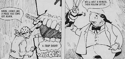
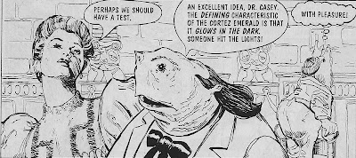 There's no time for that kind of backstory, because right on the opening page, Buzz is running late. He's headed to see Colonel Toad donate a one-of-a-kind emerald to the local museum, supposedly the last relic of the ancient Cortez culture. But before Toad can finish presenting his gift, two other citizens emerge from the crowd with their own Cortez emeralds. All three pass the glow-in-the-dark test, which should be impossible, and Toad thinks the whole affair seems suspicious. Without missing a beat, he and Buzz leap into a plane and fly off to the island where the Cortez lived before the earthquake that supposedly ended their civilization. Once they arrive, the heroes are greeted by a manic tour guide/restaurant owner who hurriedly shuffles them to a few unimpressive sights before forcing them to eat bad sandwiches.




I do appreciate the way this story begins, because it wastes no time with introductions. For a kids' book especially, this feels unusual, so I give writer Phil van Steenburgh credit for diving right into his bizarre setting and cast. This is a period piece of sorts, except I'm not entirely clear what period it's aping. Modern technology doesn't exist, but there are things like planes and cars, so...less than 100 years ago, say. Also animals and humans interact as equals, which is more important than the era. As their names suggest, Buzz is a bumblebee, about the size of a dog but with human intelligence and speech. Colonel Toad is a man-sized and well-dressed toad, who I guess is also literally a current or former colonel in whatever military exists, though the details of his record are not divulged here*.
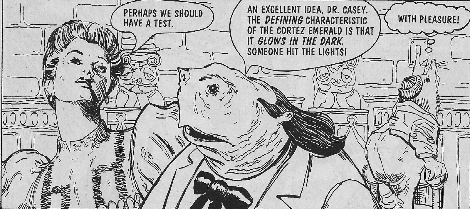

That tour guide is the story's villain, Gigi the Gypsy. It's pretty offensive, there's no doubt, that the bad guy is a gypsy dealing in illegal emeralds, and that's not the only culturally insensitive part of the story. Gigi's crime is based on the discovery that the Cortez were still alive and thriving in a hidden underground valley. They've also continued to mine emeralds all this time, so when Gigi finds them, he uses modern drugs to position himself as medicine man and therefore be in charge. He then abuses his power to sell the emeralds back home, until Buzz and Toad show up and foil his plot. Gigi is definitely exploiting the Cortez and should be stopped, but one of the things Toad most strongly objects to is that the Cortez were denied a chance to interact with modern culture. This doesn't sit very well with me the way it's presented, with a very stark and inconsiderate sense of right and wrong. Nobody asks if integrating the Cortez is actually what's best for anyone, or what they themselves want. Their first contact was with Gigi, and it led to them being lied to and taken advantage of. Why is it necessarily a good idea to move further in that direction, as opposed to allowing them to continue as they were, or even protecting them somehow? Maybe there are sound reasons, this is after all a totally fictional reality of which I've only seen the tiniest fraction, but it would've been nice if they were included, or just if the discussion took place.
There is dialogue at the end of the issue, from Toad's friend Oogles (a fancy worm, see below), stating that the Cortez are getting help adjusting to the world and that they gave Toad an emerald to thank him for what he'd done, so all's well that end's well, I guess. But there's still a gypsy antagonist for no reason other than "gypsy" being inappropriate shorthand for "untrustworthy", and an uncomfortably imperialist tone to the whole narrative.

It's also a story that moves too quickly for its own good. Any new information is stated out loud by the characters, sometimes necessary because the art's unclear, but more often I think van Steenburgh uses the young age of his target audience as an excuse to write a bit lazily. This leads to regular info dumps and moments of handwaving dialogue, corner-cutting that muddles the story in the name of moving more quickly onto the next beat. It also dampens the attempts at humor; this isn't as lighthearted an adventure as I think the creators believe it to be, and the jokes fizzle.
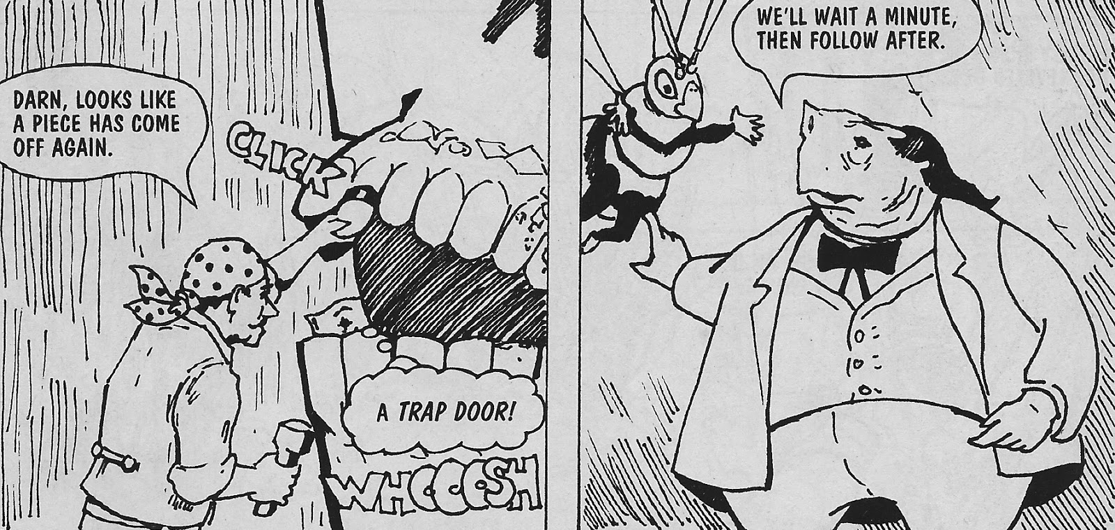
The only section that's slightly funny is the back-up feature starring Oogles. We learn that he's a professional shrew-drawn carriage driver, and I think it's amusing that in a world where giant worms wear top hats and smoke pipes (and have arms, for whatever reason) there would also be big shrews that are basically just horses. What is the logic behind that? To make it even more ridiculous, Oogles later tries to hire chipmunks to replace his shrews, even though the chipmunks can talk and stand up just like he can, so...what is the distinguishing line between which animals behave like humans and which do not? Buzz is somewhere in between, too, by which I really just mean he isn't wearing clothes.
In Oogles' story, he wants to find something to drive other than shrews, and tries a number of different methods of transportation that all fail miserably. Just as rushed as the main story, the back-up actually benefits from the pace, because the rapid-fire succession of Oogles' mistakes is much of what makes them amusing. In the end, he learns (and says) that the grass is always greener on the other side, and decides to return to his shrews. Which, since they're basically pets and therefore a responsibility to which he's already committed himself, is the best lesson for children to learn in this whole comicbook.

The art is by Alan Howell, and it's just as uneven as the writing. It can be very sparse and sketchy, and even the most detailed panels aren't especially full. And it looks like some panels are partially traced from each other, with most of the characters and set pieces in exactly the same position save for one or two minor shifts. This and the not-infrequent blank white backgrounds indicate a lack of effort similar to what's evident in some of the script, deadening the entire work.
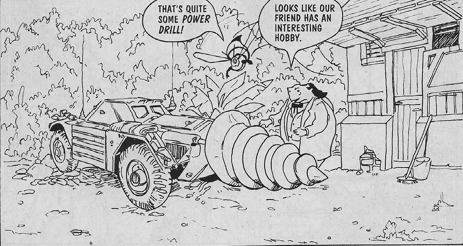
So Buzz and Colonel Toad #1 is not a winner, perhaps not worth the quarter I paid for it. I do, however, have one sprinkle of praise to toss out here at the end for Howell's work: I actually laughed when I saw Gigi's giant drill vehicle. It's a dumb plot point, since it never gets used and it's a clichéd visual that doesn't fit in this story whatsoever. But as an image, it's uniquely intricate, and thus an actual surprise, earning it's one panel and then some.
*The back cover does say that Toad's grandfather fought in the Great Swamp Wars. The most intriguing tidbit of the entire issue, I'd say.
Subscribe to:
Posts (Atom)